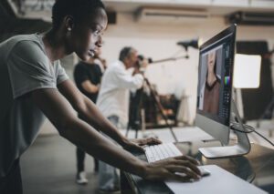
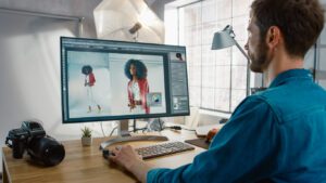
Better Pictures Are a Click Away
From iPhones to DSLRs, amateurs to professionals—we’ve got tips, tricks, and guides for taking the best possible photos.

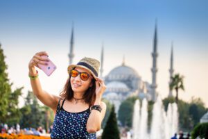
Taking good photos is more important than ever.
- First day of school.
- Holidays.
- Vacations.
You want high quality photos to capture all of life’s big moments. And let’s be honest — you can make money taking good photos with the right skills and gear.
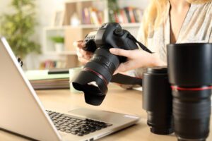
How do you know what’s actually the best? How can you spend your money wisely and get the gear you need? We’ve done the research so you can take your photos to the next level.
Check out our guides: